Crypto Technical Anaysis: How to Read Charts

Crypto markets trade 24/7, move 10–30% in hours, and attract millions of traders who all look at the same charts. Technical analysis is the skill that turns raw price data into actionable decisions — when to enter, when to exit, and when to stay out entirely. Whether you’re reading Bitcoin’s daily chart or evaluating a new altcoin on the 4-hour timeframe, the fundamentals of chart analysis remain the same.
This guide covers everything a beginner needs to start reading crypto charts with confidence — and enough depth for intermediate traders to sharpen their edge. No fluff, no generic theory: real patterns, real indicators, and real examples from crypto markets.
What Is Technical Analysis?
Technical analysis (TA) is a method of evaluating assets by studying price charts and trading volume. Unlike fundamental analysis, which asks “is this project worth investing in?”, technical analysis asks “what is the market likely to do next based on how it has behaved before?”
The core assumption is that all known information — news, sentiment, whale activity, regulatory pressure — is already reflected in the price. Your job as a technical analyst is to read the patterns that price and volume create, and use them to estimate probabilities.
A critical point that many beginners miss: technical analysis does not predict the future. It assigns probabilities to different outcomes. A head and shoulders pattern doesn’t guarantee a reversal — it tells you that historically, this formation leads to a reversal more often than not. That’s why every technical setup must be paired with risk management.
Understanding Candlestick Charts
Candlestick charts are the standard in crypto trading. Each candlestick represents a specific time period (1 minute, 1 hour, 1 day, 1 week — depending on your chart settings) and encodes four data points:
- Open: the price at the beginning of the period
- Close: the price at the end of the period
- High: the highest price reached during the period
- Low: the lowest price reached during the period
The thick part of the candle is the body — it shows the range between open and close. The thin lines above and below the body are wicks (or shadows) — they show how far the price stretched beyond the open-close range before being rejected.
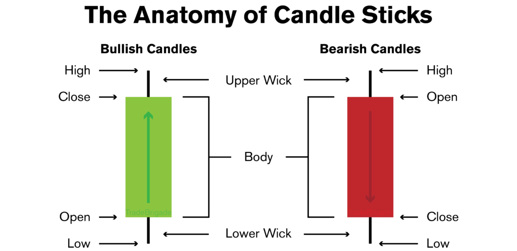
A green (bullish) candle means the close was higher than the open — buyers won that period. A red (bearish) candle means the close was lower than the open — sellers were in control. The size of the body tells you how decisive the move was. Long bodies mean strong conviction; small bodies mean indecision.
Key Candlestick Patterns to Know
Single-candle and multi-candle patterns give you quick reads on market sentiment:
| Pattern | Type | What It Signals |
|---|---|---|
| Hammer | Bullish reversal | Long lower wick, small body at top. Sellers pushed price down hard, but buyers reclaimed it. Appears after a downtrend. |
| Shooting Star | Bearish reversal | Long upper wick, small body at bottom. Buyers pushed price up but sellers rejected it. Appears after an uptrend. |
| Doji | Indecision | Open and close are nearly identical. Neither buyers nor sellers won. Often appears before a reversal. |
| Bullish Engulfing | Bullish reversal | A large green candle completely engulfs the previous red candle. Strong shift in momentum from sellers to buyers. |
| Bearish Engulfing | Bearish reversal | A large red candle completely engulfs the previous green candle. Strong shift from buyers to sellers. |
| Morning Star | Bullish reversal | Three-candle pattern: red candle, small doji/body, large green candle. Signals bottom may be in. |
| Evening Star | Bearish reversal | Opposite of morning star: green, small body, large red candle. Signals top may be in. |
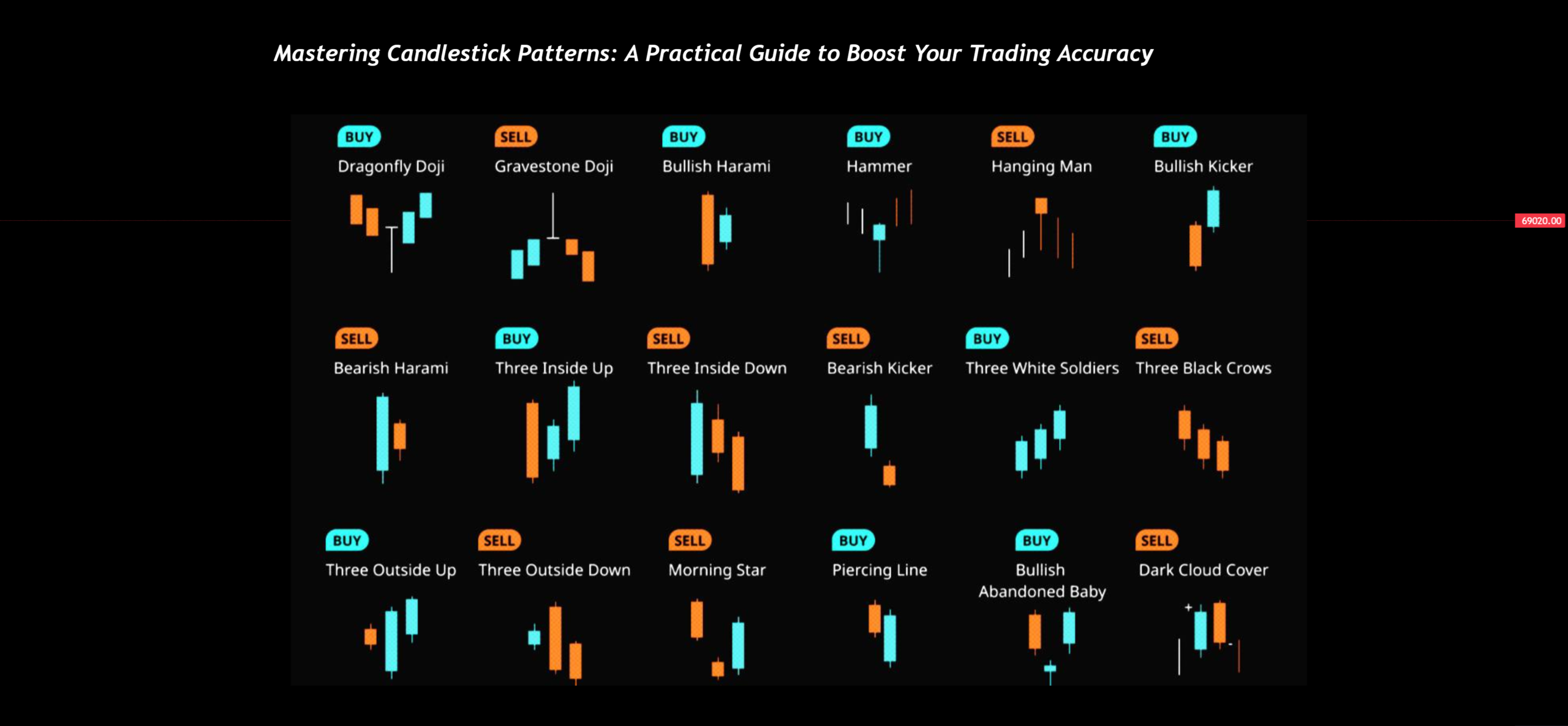
Important: never trade a candlestick pattern in isolation. A hammer on a random candle in the middle of nowhere means little. A hammer appearing at a known support level with increasing volume — that’s a signal worth paying attention to.
Support and Resistance: The Foundation of Everything
If you only learn one concept from technical analysis, make it support and resistance. These are the price levels where buying or selling pressure has historically been strong enough to stop the price from continuing in its current direction.
Support is a price level where demand is strong enough to prevent further decline. Think of it as a floor — the price falls to this level and bounces. The more times price bounces off a level, the stronger that support becomes.
Resistance is the opposite — a ceiling where selling pressure overwhelms buyers. The price rises to this level and gets pushed back down.
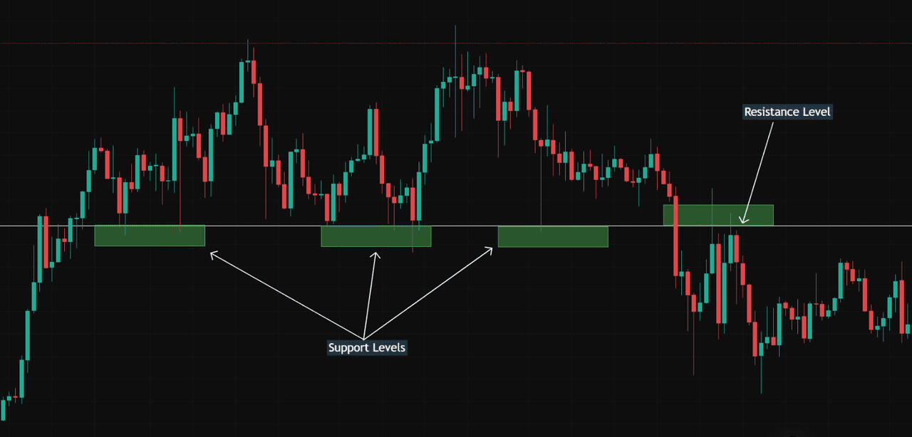
A key principle: when support breaks, it becomes resistance. When resistance breaks, it becomes support. This “flip” is one of the most reliable behaviors in crypto charts and is the basis of many trading strategies.
To identify support and resistance, look for price levels where the chart shows multiple touches — points where the price reached a level and reversed. Round numbers also act as psychological support/resistance in crypto (e.g., Bitcoin at $100,000, $90,000, $80,000). The more touches and the longer a level holds, the more significant it is.
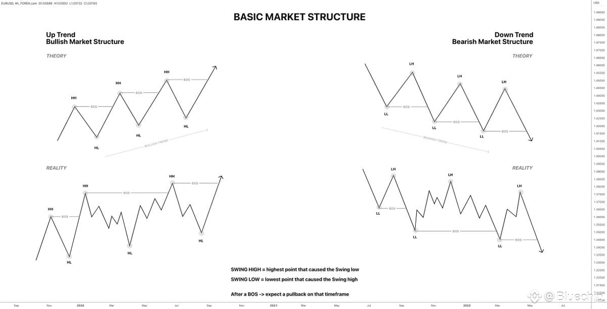
Trend Lines and Market Structure
Markets move in three directions: up, down, or sideways. Identifying the current trend is the first thing you should do before analyzing any chart.
Uptrend: a series of higher highs and higher lows. Each peak is higher than the last, and each pullback stops at a level higher than the previous low. Draw a trend line connecting the lows — this acts as dynamic support.
Downtrend: a series of lower highs and lower lows. Each rally fails at a level lower than the previous peak. Draw a trend line connecting the highs — this acts as dynamic resistance.
Range / Sideways: the price bounces between a defined support floor and resistance ceiling without making new highs or lows. Many traders wait for a breakout from the range before committing to a position.
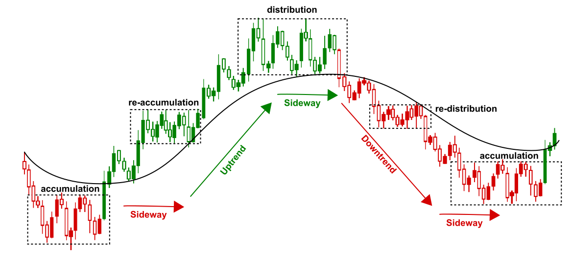
A common beginner mistake is trying to trade against the trend. The phrase “the trend is your friend” exists for a reason — the probability of a continuation move is almost always higher than the probability of a reversal. Trade with the trend until the chart gives you clear evidence that it’s changing.
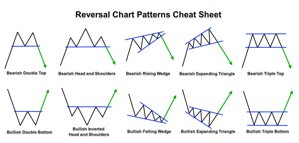
Chart Patterns Every Crypto Trader Should Know
Chart patterns form when price action creates recognizable geometric shapes over multiple candles. These patterns reflect the psychology of buyers and sellers and often lead to predictable outcomes. Here are the most important ones for crypto:
Reversal Patterns
Head and Shoulders (bearish): Three peaks where the middle one (head) is the highest, flanked by two lower peaks (shoulders). The “neckline” connects the lows between the peaks. When price breaks below the neckline, it signals a trend reversal from bullish to bearish. This is one of the most studied patterns in all of technical analysis.
Inverse Head and Shoulders (bullish): The mirror image — three troughs where the middle one is the deepest. A break above the neckline signals a reversal from bearish to bullish.
Double Top (bearish): Price reaches resistance twice, fails to break through both times, and then drops. The pattern looks like the letter “M”. It confirms when price breaks below the support between the two peaks.
Double Bottom (bullish): Price hits support twice, bounces both times, and then breaks upward. The pattern looks like the letter “W”. It confirms when price breaks above the resistance between the two troughs.
Continuation Patterns
Ascending Triangle (bullish): A flat resistance line at the top with rising lows creating an ascending support line. Each pullback is shallower than the last, showing buyers are getting more aggressive. The breakout typically happens upward through the flat resistance.
Descending Triangle (bearish): A flat support line at the bottom with declining highs. Sellers are getting more aggressive. Breakdown usually happens through the flat support level.
Symmetrical Triangle: Both support and resistance converge. This represents a true standoff between buyers and sellers. The breakout can go either way — the direction of the prior trend usually wins, but always wait for confirmation.
Bull Flag: After a sharp upward move (the “pole”), price consolidates in a small downward-sloping channel (the “flag”). This is a pause, not a reversal. When price breaks out of the flag to the upside, the move often continues with similar strength to the original pole.
Cup and Handle (bullish): A U-shaped recovery (the cup) followed by a small consolidation or slight pullback (the handle). When price breaks above the handle’s resistance, it typically triggers a strong upward move.
Essential Technical Indicators
Indicators are mathematical calculations applied to price and volume data. They help confirm what you see on the chart and filter out noise. Don’t overload your chart — two or three indicators are enough. Here are the ones that matter most:
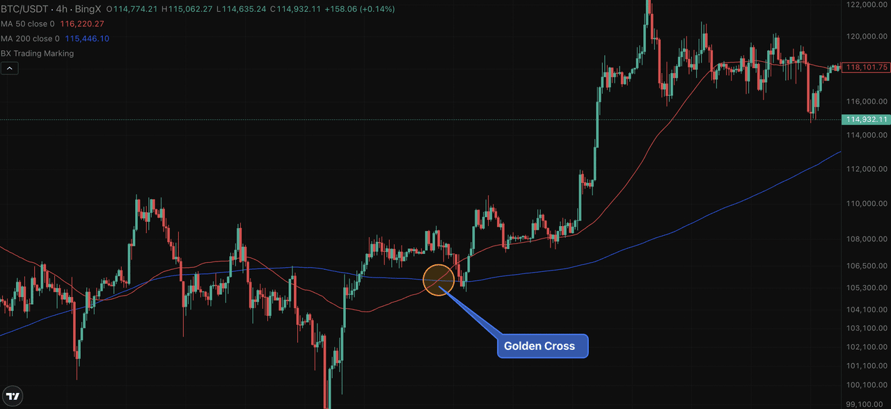
Moving Averages (MA)
Moving averages smooth out price data by calculating the average closing price over a specified number of periods.
The Simple Moving Average (SMA) gives equal weight to all periods. The Exponential Moving Average (EMA) gives more weight to recent prices, making it more responsive to current market conditions.
The most commonly used moving averages in crypto are the 20 EMA (short-term trend), 50 SMA (medium-term), and 200 SMA (long-term). When a shorter MA crosses above a longer one, it’s called a golden cross (bullish). When it crosses below, it’s a death cross (bearish).
In crypto, the 200-day SMA is widely watched as a dividing line between bull and bear market territory. When Bitcoin trades above its 200-day SMA, the overall trend is considered bullish. Below it — bearish.
Relative Strength Index (RSI)
RSI measures momentum on a scale from 0 to 100 based on the ratio of recent gains to losses. The standard setting is 14 periods.
Above 70: the asset is considered overbought — it may be due for a pullback. Below 30: the asset is considered oversold — it may be due for a bounce.
However, in strong trends, RSI can stay overbought or oversold for extended periods. During a Bitcoin bull run, RSI can hover above 70 for weeks. The more powerful signal is RSI divergence: when the price makes a new high but RSI makes a lower high (bearish divergence), or when price makes a new low but RSI makes a higher low (bullish divergence). Divergence often precedes significant reversals.
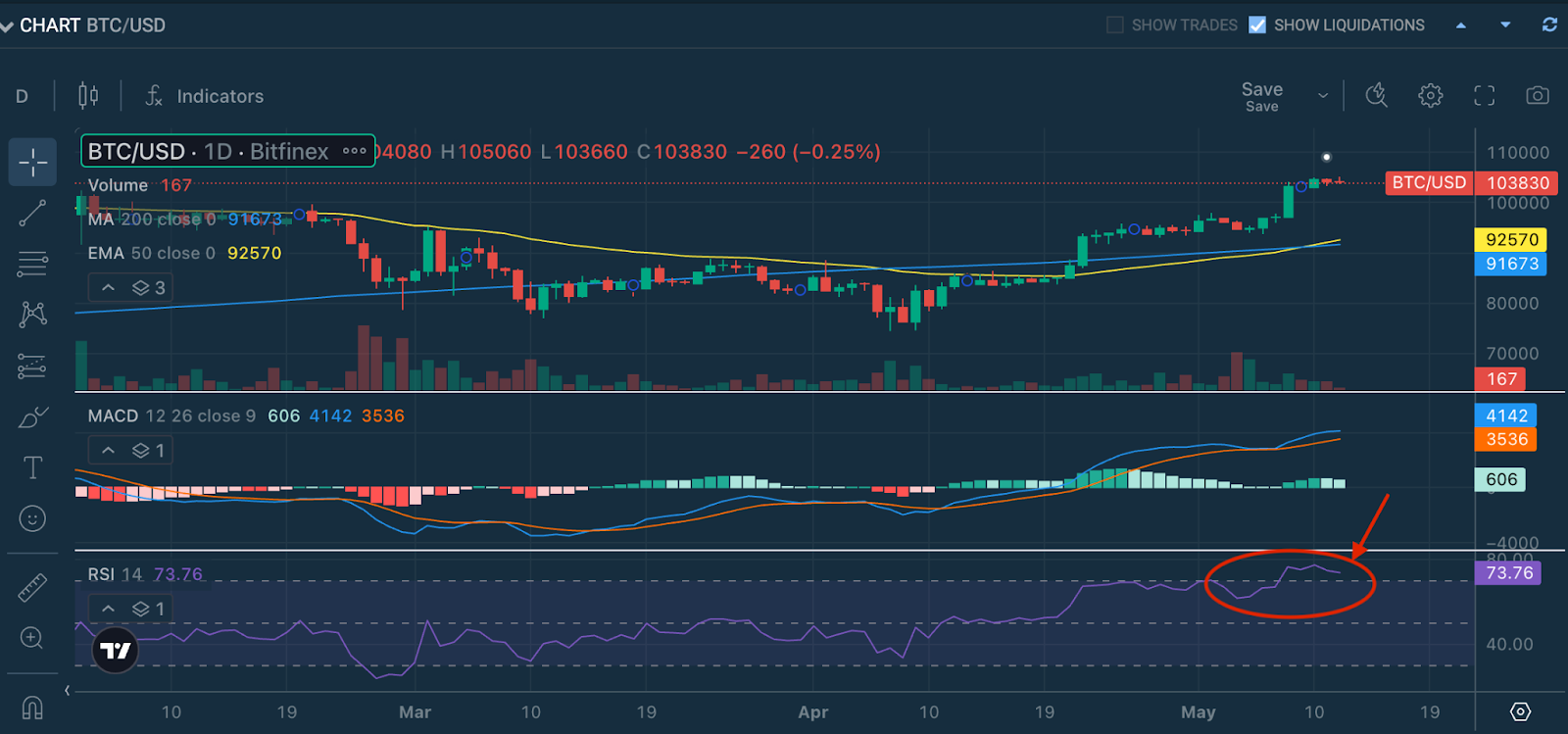
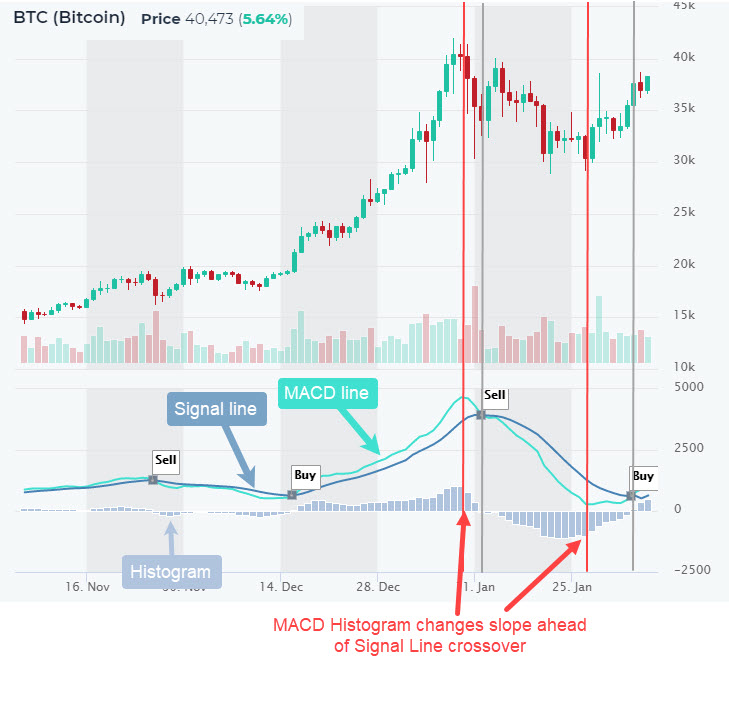
MACD (Moving Average Convergence Divergence)
MACD consists of two lines and a histogram. The MACD line is the difference between the 12-period EMA and the 26-period EMA. The signal line is the 9-period EMA of the MACD line. The histogram shows the distance between the two.
When the MACD line crosses above the signal line, it generates a bullish signal. When it crosses below, it’s bearish. The histogram visualizes the momentum — growing bars mean the trend is strengthening, shrinking bars mean it’s weakening.
Like RSI, MACD is especially powerful when it diverges from price. If Bitcoin is making higher highs but MACD is making lower highs, the uptrend is losing steam even though price hasn’t dropped yet.
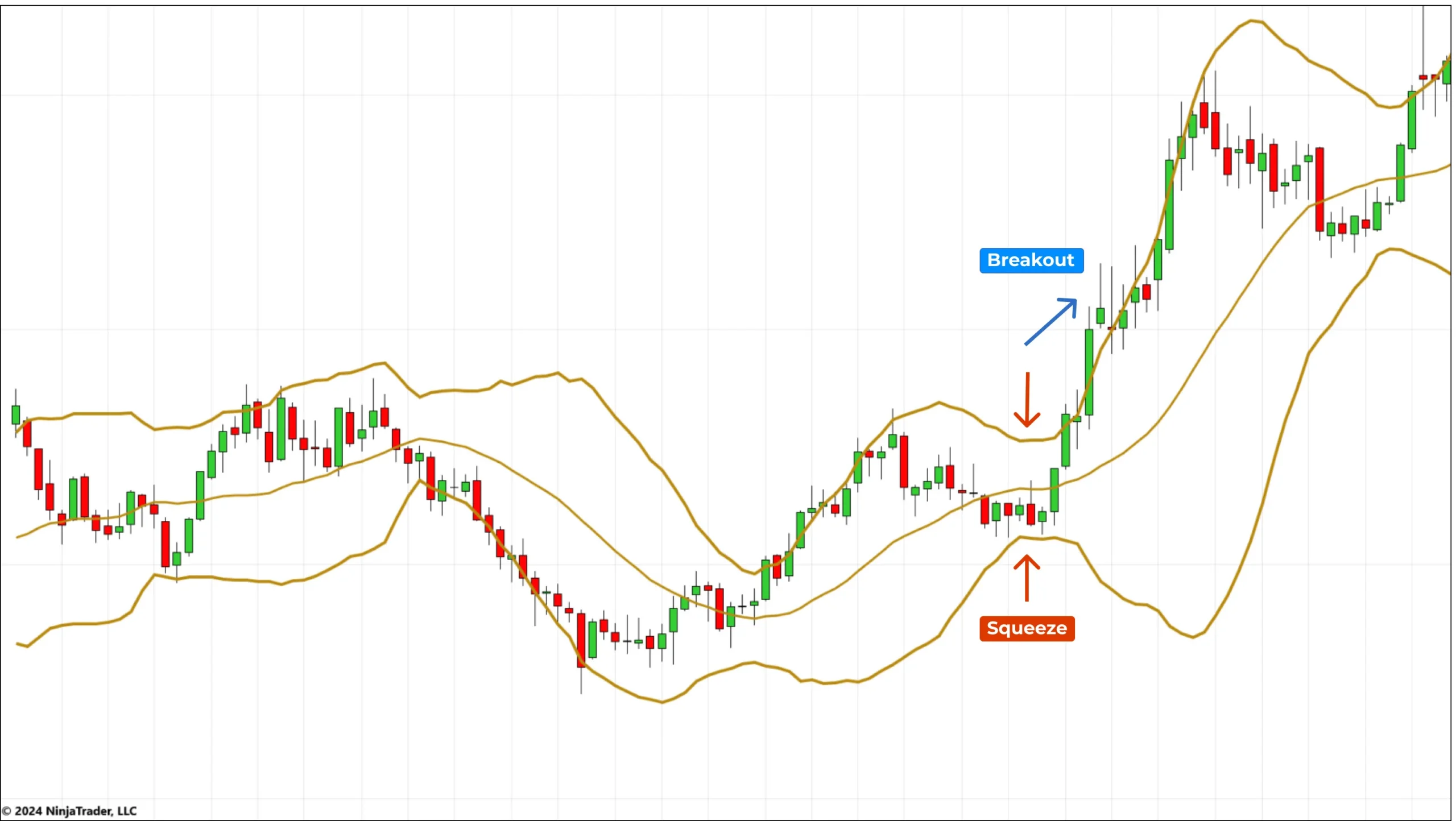
Bollinger Bands
Bollinger Bands consist of a 20-period SMA in the middle with two bands plotted two standard deviations above and below. They expand during high volatility and contract during low volatility.
The key signal: when the bands squeeze tight (low volatility), a big move is likely coming — though the bands don’t tell you which direction. When price touches or breaks outside the upper band, the asset may be extended. When it touches the lower band, it may be oversold. A “Bollinger squeeze” followed by a breakout is one of the most reliable volatility-based setups in crypto.
Volume: The Confirmation You Can’t Ignore
Volume is the number of units traded during a specific period. It is the single most important confirmation tool in technical analysis, yet many beginners ignore it entirely.
Volume confirms breakouts. If price breaks above resistance on high volume, it’s far more likely to be a genuine breakout than if volume is low. A low-volume breakout is suspicious — it often turns into a false breakout (sometimes called a “fakeout”) where price quickly reverses back inside the range.
Volume confirms trends. In a healthy uptrend, volume should increase on green (up) candles and decrease on red (down) candles. If volume starts declining as price makes new highs, the trend may be exhausting — a warning sign even if price looks fine.
Volume spikes signal capitulation. An abnormally large volume bar — especially on a sharp down candle after a prolonged decline — often marks a selling climax. It’s the moment where the last holdouts dump their positions, and smart money starts accumulating. These spikes don’t guarantee a bottom, but they’re worth watching closely.
Timeframes: Which One Should You Use?
The same chart can look bullish on one timeframe and bearish on another. Choosing the right timeframe depends on your trading style:
| Trading Style | Primary Timeframe | Confirmation Timeframe |
|---|---|---|
| Scalping | 1-minute, 5-minute | 15-minute, 1-hour |
| Day Trading | 15-minute, 1-hour | 4-hour, daily |
| Swing Trading | 4-hour, daily | Weekly |
| Position Trading / Investing | Daily, weekly | Monthly |
A best practice is multi-timeframe analysis: identify the trend on a higher timeframe, then find entries on a lower timeframe. For example, if the daily chart shows Bitcoin in an uptrend, switch to the 4-hour chart to find a pullback to support for a better entry. This approach aligns your trades with the larger trend while optimizing your entry price.
Patterns on higher timeframes (daily, weekly) are more reliable than those on lower timeframes. A head and shoulders on the daily chart carries far more weight than the same pattern on a 15-minute chart.
Best Free Charting Tools for Crypto
You don’t need expensive software to analyze crypto charts. These platforms cover everything beginners and intermediate traders need:
| Platform | Best For | Free Plan? |
|---|---|---|
| TradingView | The industry standard. Best charting tools, community ideas, alerts. Supports all major crypto pairs. | Yes (limited indicators/alerts) |
| Coinglass | Derivatives data: funding rates, open interest, liquidation maps. Essential for leveraged trading. | Yes |
| DexScreener | On-chain token charts for DEX pairs (Uniswap, Raydium, etc.). Essential for altcoin traders. | Yes |
| altFINS | Automated chart pattern recognition across hundreds of crypto assets. Scans 24/7. | Limited free tier |
TradingView is where most traders start and many never leave. Its free plan is sufficient for learning — create an account, add BTC/USDT on the Binance feed, and start practicing with the indicators described in this guide.
Putting It All Together: A Practical Analysis Workflow
When you open a chart, follow this sequence instead of randomly clicking through indicators:
- Identify the trend. On the daily or 4-hour chart, determine if the market is in an uptrend, downtrend, or range. Use the 200 SMA as your baseline.
- Mark key support and resistance levels. Find the price levels where the chart shows clear reactions — multiple bounces, rejections, or breakout-retest patterns.
- Look for chart patterns. Is a triangle forming? Is there a double bottom at support? Is price approaching a head-and-shoulders neckline?
- Check indicators for confirmation. Is RSI showing divergence? Has MACD crossed? Are Bollinger Bands squeezing?
- Check the volume. Does volume confirm the move? A breakout on low volume is unreliable.
- Define your trade. Entry price, stop-loss level (where your thesis is invalid), and take-profit target. Calculate your risk-to-reward ratio — aim for at least 2:1 (risking $1 to make $2).
- Manage the trade. Don’t move your stop-loss further away. If the setup is invalidated, accept it and move on.
This workflow prevents the #1 beginner mistake: entering trades based on a “feeling” or a single indicator rather than a structured analysis.
Common Mistakes to Avoid
Technical analysis is a skill, and like any skill, beginners make predictable errors. Here are the ones that cost the most money:
Indicator overload. Stacking 10 indicators on a chart creates noise, not clarity. Three indicators maximum is a good rule. If they all say different things, you don’t have a signal.
Ignoring volume. A breakout without volume is not a breakout. Check every move against volume before acting on it.
Trading against the trend. Trying to catch the exact top or bottom is a losing game. Trade with the trend and look for confirmation before entering counter-trend positions.
No stop-loss. Every trade needs a predefined exit point where your analysis is proven wrong. Without it, small losses become catastrophic ones.
Confirmation bias. If you’re already bullish on a coin, you’ll only see bullish signals on the chart. Force yourself to look for what could go wrong. The best analysts are the ones who actively try to disprove their own thesis.
Trading too low a timeframe. The 1-minute chart is noise for most traders. Start with the daily chart and work down. You’ll see clearer signals and make fewer impulsive decisions.
FAQ
Does technical analysis actually work for crypto?
Yes, but with caveats. Chart patterns work because they reflect human psychology, and crypto markets are highly emotional. However, crypto has unique risks: low-liquidity tokens can be manipulated by whales, and major news events (hacks, regulation, macro shocks) can override any technical setup instantly. TA gives you probabilities, not certainties — which is why risk management is non-negotiable.
What is the best timeframe for beginners?
Start with the daily chart. It filters out most noise and shows the clearest patterns. Once you’re comfortable reading daily charts, move to the 4-hour timeframe for more precise entries. Avoid the 1-minute and 5-minute charts until you have significant experience — they’re fast, noisy, and unforgiving.
How many indicators should I use?
Two to three is the sweet spot. A common beginner setup: one moving average (50 or 200 SMA), RSI, and volume. This gives you trend direction, momentum, and confirmation — everything you need for most setups. Adding more indicators often leads to analysis paralysis.
What’s the difference between SMA and EMA?
Both are moving averages, but the SMA weights all periods equally while the EMA gives more weight to recent prices. The EMA reacts faster to new price action, which makes it more useful for short-term trading. For longer-term trend identification, SMA is more stable and widely used (especially the 200-day SMA).
Can I learn technical analysis for free?
Absolutely. TradingView offers free charting with most indicators. The best way to learn is by practice: open a BTC/USDT chart, apply the concepts from this guide, and start marking support/resistance levels, identifying patterns, and observing how price reacts. Paper trading (simulated trading without real money) is available on most exchanges and is the safest way to develop your skills.
Is technical analysis enough, or do I need fundamental analysis too?
For short-term trading (day trading, scalping), technical analysis alone can be sufficient. For swing trading and longer-term positions, combining TA with fundamental analysis (tokenomics, team, on-chain metrics, market catalysts) gives you a much more complete picture. The strongest trades are those where both the technicals and fundamentals align.
What to Do Next
Reading about charts is useful. Practicing on actual charts is where learning happens. Open TradingView right now, pull up the BTC/USDT daily chart, and try this: draw horizontal lines at the most obvious support and resistance levels. Add the 200 SMA. Turn on volume. Look for any chart patterns forming. Then check RSI — is it overbought, oversold, or showing divergence?
Do this daily for two weeks and you’ll start seeing patterns the way experienced traders do. Technical analysis is a visual language — the more charts you read, the more fluent you become.
Disclaimer: This article is for educational purposes only and does not constitute financial advice. Cryptocurrency trading carries significant risk. Never trade with money you cannot afford to lose.


Soi cầu 68? Let’s get some winning tips folks! Give it a whirl maybe you can find some winning numbers: soi cầu 68
Agentrich9 is pretty legit, folks. I’ve had some decent runs there. Worth checking out if you’re looking for a new spot to spin those reels. See for yourself at agentrich9.
Gotta get back in the game! Time for some 80 jili casino login action. This one’s for you 80 jili casino login. Wish me luck!
[url=https://sozdanie-sajtov-1.ru]Создание сайтов[/url] — стоит ли делать редизайн существующего сайта или проще начать с нуля?